How to Visualize Systematic Review Results Effectively
How to Visualize Systematic Review Results Effectively

Visualizing systematic review results is the process of converting structured evidence tables into charts, diagrams, and interactive maps that make complex findings readable and reproducible. Researchers who skip this step produce reviews that are technically sound but practically opaque. The three standards that govern this process are PRISMA 2020, Cochrane ROB 2, and the FAIR data principles. Each one addresses a different layer of transparency: study selection, risk of bias, and data shareability. Mastering all three is what separates a publishable review from a well-organized spreadsheet.
How to visualize systematic review results: foundational data prep
No visualization is more reliable than the data feeding it. The first step is registering your protocol on PROSPERO before screening begins. Registration creates a public record of your methods, which means any visual output you produce later can be traced back to a pre-specified plan. Protocol transparency is a hallmark of reproducibility in systematic review visual outputs.
Screening calibration comes next. Cohen’s kappa above 0.80 is the accepted benchmark for inter-rater agreement before full-text screening begins. A kappa below that threshold means your inclusion decisions are inconsistent, and any PRISMA flow diagram built on those decisions will misrepresent your actual selection process.

Data structuring is the third pillar. Raw extraction tables frequently contain multi-value cells: one paper may report three outcomes, four populations, or two interventions. Leaving those cells unsplit creates mapping errors downstream. Tokenization engines that dynamically split arrays and map hierarchical relationships are the correct solution. They align with FAIR data principles and eliminate the manual errors that plague large-scale reviews.
Key preparation steps before any chart is produced:
- Register your protocol on PROSPERO with full screening and extraction criteria documented
- Run calibration batches on title-abstract screening before full-scale extraction
- Normalize multi-value fields using tokenization so each value occupies its own row
- Map hierarchical relationships (e.g., intervention subtypes under parent categories) before visualization
- Document every data-cleaning decision so an external reviewer can replicate your workflow
Pro Tip: Structure your extraction table so each column maps directly to one visual output. If you plan a forest plot, you need a dedicated column for effect size and one for confidence interval. Mixing those values in a single cell makes automated chart generation impossible.
Organizing your data tables correctly from the start cuts visualization time significantly and prevents the most common errors in published reviews.
What are the standard visual outputs for systematic reviews?
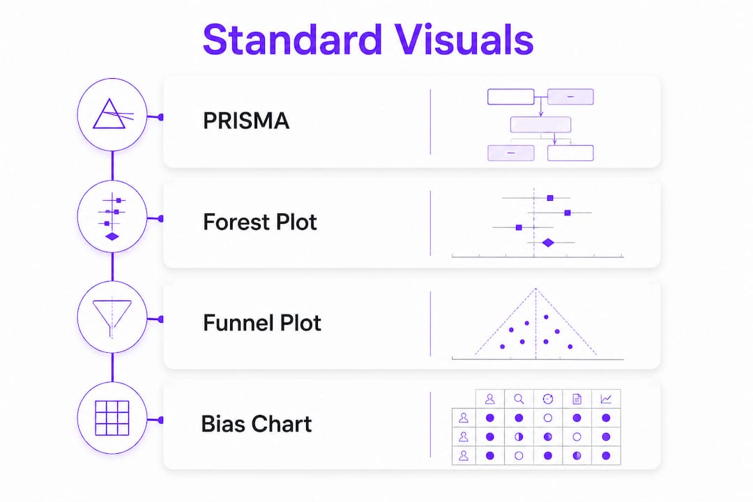
Three chart types appear in nearly every published systematic review: PRISMA flow diagrams, forest plots, and risk of bias charts. Each one answers a specific question about your evidence base.
PRISMA 2020 flow diagrams
A PRISMA 2020 flow diagram shows exactly how many records entered your search, how many were screened, and how many were excluded at each stage. Python-based pipelines using Plotly and Graphviz automate the creation of publication-ready PRISMA diagrams without manual coding. That matters because hand-drawn PRISMA diagrams frequently contain arithmetic errors that reviewers catch immediately.
Forest plots and funnel plots
Forest plots display the effect size of each included study alongside a pooled estimate. A well-constructed forest plot shows the point estimate, the confidence interval, and the weight each study contributes to the meta-analysis. Web-based meta-analysis tools generate high-resolution forest and funnel plots and perform heterogeneity tests following Cochrane ROB 2 guidelines. These tools support effect size models including mean difference (MD), Hedges’ g, risk ratio (RR), and odds ratio (OR), covering most clinical and behavioral research designs.
Funnel plots test for publication bias. An asymmetric funnel suggests that small, negative studies are missing from the literature. Always report the statistical test alongside the plot.
Risk of bias charts
Cochrane ROB 2 traffic-light plots assign a judgment of low, some concerns, or high risk to each study across five bias domains. ROB 2 visualization tools output these charts in formats ready for academic manuscripts. The color coding makes bias patterns visible at a glance, which is far more useful to readers than a table of text judgments.
The table below summarizes each standard output and its primary function:
| Visual output | Primary function | Key standard |
|---|---|---|
| PRISMA flow diagram | Documents study selection process | PRISMA 2020 |
| Forest plot | Synthesizes effect sizes across studies | Cochrane guidelines |
| Funnel plot | Detects publication bias | Cochrane guidelines |
| ROB 2 traffic-light plot | Displays risk of bias by domain | Cochrane ROB 2 |
Pro Tip: Run your heterogeneity test (I² statistic) before deciding whether to pool results. An I² above 75% signals substantial heterogeneity. Pooling those results in a forest plot without subgroup analysis will mislead readers.
How do Evidence Gap Maps and network meta-analysis visuals add depth?
Standard charts answer “what did the studies find?” Advanced interactive visuals answer “where are the gaps, and how do treatments compare across an entire network?” These are different questions, and they require different tools.
Evidence Gap Maps
An Evidence Gap Map (EGM) is a structured matrix that plots research dimensions (interventions, outcomes, populations) against evidence volume. EGMs classify evidence density as critical (1 study), sparse (2–3), moderate (4–6), rich (7–9), or abundant (10 or more). That classification turns a raw count into a research priority signal. A cell marked “critical” tells funders and researchers exactly where new trials are needed.
Interactive EGMs go further. Researchers can filter by study design, flag specific cells for follow-up, and export subsets of the evidence base. EGMs function as decision-support tools that translate synthesis outcomes into research priorities. That makes them useful not just for academic audiences but for policy teams and funding bodies.
Network meta-analysis visualizations
Network meta-analysis (NMA) compares multiple treatments simultaneously, even when no head-to-head trial exists. The network diagram shows which treatments have been directly compared and which comparisons are inferred. Interactive NMA tools link network diagrams with risk of bias measures and effect modifiers, making the assumptions behind each indirect comparison visible.
Transitivity assessment is the most overlooked part of NMA reporting. Interactive box plots and scatter plots dynamically linked to the network diagram let researchers explore whether the studies feeding each comparison share similar characteristics. Without that check, the network’s indirect estimates are untrustworthy.
Key advantages of interactive advanced visualizations:
- Researchers can filter evidence by study design, population, or outcome without rebuilding the chart
- Stakeholders without statistical training can explore findings through point-and-click interfaces
- Linked visuals expose the relationship between bias and effect size in real time
- Exported subsets support targeted reporting for different audiences
The primary aim of interactive NMA visualizations is to make complex findings accessible and reproducible, not merely aesthetic. That distinction matters when reviewers and journal editors evaluate your transparency.
What are the best practices for reproducible visualization?
Reproducibility in visualization means that a second researcher, working from your protocol and raw data, produces the same charts you did. Most reviews fail this test because decisions made during data cleaning and chart generation are never documented.
Automation aligned with FAIR principles is the most reliable path to reproducibility. When a Python script or a web-based pipeline generates your charts, every parameter is recorded in the code. Manual chart generation in a spreadsheet application leaves no audit trail.
Common reproducibility failures and how to fix them:
- Undocumented exclusion logic: Record every rule used to exclude records from your dataset, not just from your review
- Inconsistent field naming: Standardize column headers before extraction so automated pipelines read them correctly
- Unlinked visualizations: Every chart should reference the protocol version and the dataset version it was generated from
- Missing calibration records: Store kappa scores and calibration batch results alongside your final data file
- Ad hoc color choices: Use the color schemes specified by PRISMA 2020 and Cochrane ROB 2 so charts are immediately recognizable to readers
Pro Tip: Version-control your extraction dataset using a tool like Git or a timestamped file naming convention. If a reviewer asks you to regenerate a chart after adding two studies, you need to know exactly which dataset version produced the original.
Peer-reviewed extraction practices reduce the subjective errors that make visualization outputs unreliable. Detailed protocol documentation, as required by PROSPERO, gives every visual output a traceable origin.
Key Takeaways
Effective visualization of systematic review results requires structured data, calibrated screening, and automated pipelines tied to PRISMA 2020, Cochrane ROB 2, and FAIR principles.
| Point | Details |
|---|---|
| Protocol registration first | Register on PROSPERO before screening to give every visual output a traceable, pre-specified foundation. |
| Calibrate before you extract | Achieve Cohen’s kappa above 0.80 before full-text screening to keep PRISMA flow diagrams accurate. |
| Automate chart generation | Use Python pipelines or web-based tools to produce PRISMA diagrams, forest plots, and ROB 2 charts without manual errors. |
| Use EGMs for gap analysis | Evidence Gap Maps classify evidence density and translate synthesis findings into research priority recommendations. |
| Document every decision | Record all data-cleaning and chart-generation choices so a second researcher can reproduce your visuals exactly. |
What I’ve learned from watching visualization workflows break down
The most common failure I see in systematic review visualization is not a technical one. Researchers spend weeks perfecting their search strategy and then treat the visualization step as an afterthought. They export a raw table, open a chart wizard, and produce something that technically meets journal requirements but communicates almost nothing.
The shift that changes everything is treating visualization as part of your systematic review workflow from day one, not as a final formatting task. When you structure your extraction table with specific charts in mind, the data flows directly into automated pipelines. When you document your calibration scores and protocol decisions as you go, your PRISMA diagram becomes a genuine record of your process rather than a retroactive reconstruction.
Interactive tools have changed what is possible for PhD candidates specifically. An Evidence Gap Map that a committee member can click through during a defense is more persuasive than a static table. An NMA network diagram that links directly to bias assessments answers the “how do you know this is reliable?” question before it is asked.
The automation argument is not about saving time, though it does that. It is about removing the human error that accumulates when researchers manually transcribe numbers into chart templates at midnight before a submission deadline. I have seen forest plots with transposed confidence intervals make it through peer review. Automated pipelines do not make that mistake.
The researchers who produce the clearest visual outputs are not the ones with the most design skill. They are the ones who built their data structure correctly at the start and let the tools do the rest.
— Ubada
Papersynapse automates the hardest parts of review visualization
Systematic review visualization depends on clean, structured data extracted consistently across hundreds of papers. That extraction step is where most workflows break down.

Papersynapse uses AI to read abstracts and fill structured extraction tables automatically, processing up to 200 papers in under two minutes. Researchers import references directly from Scopus or Web of Science, and the platform normalizes the output into formats ready for PRISMA diagrams, ROB 2 charts, and forest plot pipelines. The workflow integrates extraction, normalization, and analysis in one place, which means the data feeding your visualizations is consistent from the first paper to the last. Explore Papersynapse’s review platform to see how automated extraction supports publication-ready visual outputs.
FAQ
What is the first step to visualize systematic review results?
Register your protocol on PROSPERO and structure your extraction table before screening begins. Clean, pre-specified data is the foundation every visualization depends on.
What does a PRISMA 2020 flow diagram show?
A PRISMA 2020 flow diagram documents the number of records identified, screened, and included or excluded at each stage of your review. Automated tools using Plotly and Graphviz generate these diagrams directly from your screening data.
When should I use an Evidence Gap Map instead of a forest plot?
Use an Evidence Gap Map when your goal is to show where evidence is missing across a research field rather than to pool effect sizes. EGMs classify evidence density from critical (1 study) to abundant (10 or more studies) and support research priority decisions.
How do I check for publication bias in a meta-analysis?
Generate a funnel plot and run a statistical asymmetry test alongside it. An asymmetric funnel suggests that small, negative studies are underrepresented in the published literature.
What is Cohen’s kappa and why does it matter for visualization?
Cohen’s kappa measures agreement between two screeners. A kappa above 0.80 confirms that your inclusion decisions are consistent, which makes the study counts in your PRISMA flow diagram reliable and replicable.