Data Visualization Team Research: A Practical Guide
Data Visualization Team Research: A Practical Guide
Data visualization team research is the coordinated practice of designing, building, and validating visual representations of data across a research team, where visualization serves not just as a reporting tool but as a shared medium for discovery, alignment, and communication. Grounded in design principles like the 5 C’s and supported by visual analytics research showing that interactive representations can act as boundary objects in multidisciplinary teams, this practice turns raw findings into decisions. Success looks like this: visuals that get adopted, results that are reproducible, and stakeholders who act on what they see.
Key Takeaways
Effective data visualization team research requires cross-functional collaboration, shared design principles, and reproducible workflows that connect literature extraction to publication-ready outputs.
| Point | Details |
|---|---|
| Prioritize adoption first | A chart nobody uses has zero impact; validate with stakeholders before finalizing any visual. |
| Set a semantic layer early | A shared metric registry prevents inconsistent numbers across reports and dashboards. |
| Schedule co-analysis sessions | Involving stakeholders in the analysis phase cuts at least one full revision round. |
| Match tools to workflow stage | Use ggplot2 or D3.js for reproducible figures; Tableau or Power BI for interactive stakeholder dashboards. |
| Apply the 5 C’s as a checklist | Clear, Concise, Consistent, Contextual, and Correct are the five questions to ask before any visual ships. |
Table of Contents
- What data visualization actually covers in a research workflow
- The design principles every research team should internalize
- Who does what on a data visualization research team
- How collaborative visualization workflows run day to day
- Which tools fit which parts of a research team’s stack
- How to evaluate whether a visualization is actually working
- Common mistakes research teams make with visualization
- A 90-day checklist for setting up a visualization practice
- How a literature-review team used Papersynapse to accelerate insight
- An editorial perspective on what teams get wrong
- Sources
What data visualization actually covers in a research workflow
Visualization touches every phase of research, not just the final figures in a manuscript. The work shifts in character as the project moves forward.
- Exploration phase: Quick, rough plots to find patterns, outliers, and data-quality issues. Think scatter plots, histograms, and heatmaps generated in R or Python before any hypothesis is confirmed.
- Confirmatory analysis: More deliberate charts that test whether a pattern holds. Outputs here feed peer review, so reproducibility matters from the start.
- Synthesis: Visual summaries that aggregate findings across studies or datasets, common in systematic reviews and meta-analyses.
- Publication and stakeholder communication: Polished figures for manuscripts, interactive dashboards for funders, and visual summaries for non-specialist audiences.
Upstream, visualization depends on clean data pipelines and semantic layers. Downstream, it produces exportable charts, reproducible figure scripts, and structured tables that other teams can reuse. Getting that chain right is what separates a visualization practice from a one-off charting exercise.
The design principles every research team should internalize
The 5 C’s framework gives teams a portable checklist for any visual decision. Paired with four core pillars, it maps directly to the choices teams face on every project.
| 5 C’s | What it means for research visuals | Pillar it maps to |
|---|---|---|
| Clear | One main message per chart; no competing narratives | Purpose |
| Concise | Remove gridlines, legends, and labels that add no information | Simplification |
| Consistent | Same color scale, axis range, and terminology across all figures | Audience |
| Contextual | Annotations that explain what a finding means, not just what it shows | Purpose |
| Correct | Encodings that match the data type (e.g., no pie charts for time series) | Encoding |
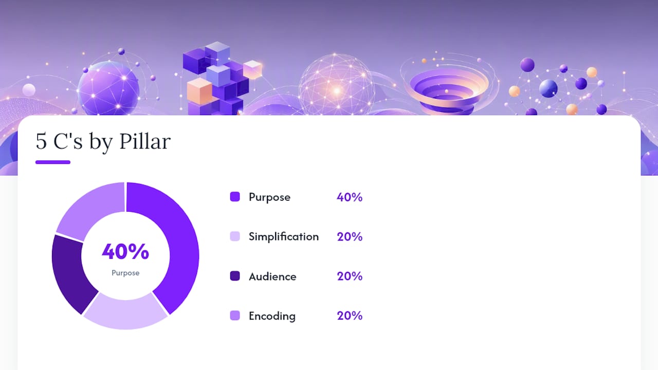
The four pillars, Audience, Purpose, Encoding, and Simplification, are the decision layer beneath the checklist. Audience determines how much annotation you need. Purpose determines which chart type is appropriate. Encoding governs which visual channel (color, position, size) carries the most important variable. Simplification is the discipline of removing everything that doesn’t serve the other three.
Preattentive attributes, specifically color, shape, and position, are processed by the visual system before conscious attention kicks in. Research confirms that the visual system extracts global statistics quickly but struggles with precise comparisons, so effective research visuals guide attention to the one comparison that matters rather than presenting everything at once.
Pro Tip: In research contexts, the temptation is to show all the data to prove rigor. Resist it. A supplementary figure can carry the full dataset; the main figure should carry the argument.
Who does what on a data visualization research team
Most research teams understaff visualization and overload analysts. Here are the roles that actually matter, and what each one owns.

Data visualization specialist converts complex datasets into visual formats that accelerate exploration and make outputs accessible to non-technical stakeholders. Per Coursera’s role guidance, this role emphasizes representation and accessibility, distinct from statistical inference.
Data analyst owns the metrics and the underlying aggregations. They define what gets measured and validate that the numbers feeding a chart are correct.
Analytics engineer builds and maintains the semantic layer, the agreed definitions of metrics that prevent two charts from showing different numbers for the same question. Teams that own more of the data chain produce more trusted dashboards.
UX/UI designer handles layout, accessibility, and the viewing surface, whether a dashboard renders on a laptop or a conference poster.
Principal investigator or stakeholder sets research priorities and signs off on what a visualization needs to communicate. Their involvement early prevents late-stage redesigns.
Project or delivery manager tracks artifact cadence and keeps review cycles from stalling.
On team models: a centralized center of excellence works well for governance and standards. A federated model, where visualization specialists sit inside domain teams, trades some consistency for speed and local relevance. IBM’s guidance on modern data teams recommends a hybrid, central governance plus local execution, as the most practical balance. Jon Schwabish at PolicyViz makes the same case from a practitioner angle: siloed work is the leading organizational mistake, and cross-functional collaboration is what actually moves decision-makers.
How collaborative visualization workflows run day to day
A repeatable workflow reduces rework and keeps stakeholders from seeing a finished chart for the first time at the wrong moment.
- Discovery: PI and analyst align on the research question and the audience for the output.
- Exploration: Visualization specialist produces rough exploratory plots; analyst flags data-quality issues.
- Prototype: First draft chart with real data, shared as a data snapshot plus a prototype figure.
- Stakeholder review: PI and any domain experts review the prototype. Feedback is collected in one session, not asynchronously over email.
- Iterate: Specialist revises encoding, annotations, and layout based on consolidated feedback.
- Validate: Interpretability check, accessibility review, and reproducibility verification before the figure is finalized.
- Publish or deploy: Manuscript figure exported as a reproducible script; dashboard deployed with a refresh schedule and an owner.
Visual analytics research by Bhavnani et al. shows that when representations evolve in response to team feedback, they act as boundary objects that integrate disciplinary perspectives and surface insights no single team member would reach alone.
Pro Tip: Newsroom data teams shorten feedback cycles by involving stakeholders in the analysis phase, not just the review phase. Schedule a 20-minute co-analysis session before the first prototype. You’ll cut at least one full revision round. Observable’s documentation of this practice is worth reading before your next project kickoff.
Which tools fit which parts of a research team’s stack
Tool choice follows workflow, not the other way around. Here’s how the main categories break down.
BI platforms like Tableau and Microsoft Power BI handle interactive dashboards and stakeholder-facing reporting well. Both support scheduled data refreshes and role-based access, which matters for multi-site research projects. Tableau’s best-practice guidance covers format and audience tailoring in detail.
Visualization libraries like D3.js and ggplot2 give researchers full control over encoding and layout. ggplot2 is the standard for reproducible manuscript figures in R-based workflows. D3.js is the choice when interactivity and custom web-based displays are required.
Research-specific platforms like Papersynapse address a different problem: extracting and structuring data from literature before any visualization begins. Papersynapse imports references from Scopus or Web of Science, uses AI to read abstracts and fill structured tables, and exports results as charts or CSV/PNG files. That structured output feeds directly into ggplot2 or Tableau pipelines, connecting the literature-review phase to the visualization phase without a manual extraction step. For practical guidance on visual formats suited to systematic review outputs, the Papersynapse blog on visualizing review results is a useful starting point.
Selection criteria to apply before committing to any tool: Who is the audience? Does the output need interactivity or is a static figure sufficient? Can the pipeline reproduce the figure from raw data? Does the tool scale to the dataset size? Does it integrate with the team’s existing data infrastructure?
For research teams that include students or early-career members building tool fluency, a broader guide to engineering and research software can help frame the learning path.
How to evaluate whether a visualization is actually working
Shipping a chart is not the same as communicating a finding. These checks catch problems before they reach a journal or a funder.
- Interpretability: Ask someone outside the immediate team to state the chart’s main message in one sentence. If they can’t, the encoding or annotation needs work.
- Annotation and context: Every axis label, unit, and data source should be present. A reader should not need to consult a separate document to understand what they’re looking at.
- Accessibility: Check color contrast against WCAG 2.1 AA standards. Add alternative text for any figure that will appear in a digital publication. Verify that the legend is readable at the intended display size.
- Reproducibility: For manuscript figures, confirm the chart can be regenerated from the raw data using a documented script. One undocumented manual step breaks the chain.
- Dashboard refresh and latency: For live dashboards, verify that data refreshes on the agreed schedule and that stale data is flagged visibly.
Impact metrics worth tracking: adoption rate (are stakeholders actually using the dashboard?), time-to-insight (how long from data update to a decision?), and reduction in feedback cycles across successive projects. For published figures, downstream citation or reuse by other research teams is a meaningful signal.
Common mistakes research teams make with visualization
Siloed work is the most expensive mistake. When designers, analysts, and researchers operate in separate lanes, the resulting visuals often answer the wrong question or use inconsistent numbers. The fix is structural: cross-functional reviews at the prototype stage, not handoffs at the end.
Inconsistent metric definitions produce charts that contradict each other across reports. A lightweight metric registry, a shared document where each metric’s definition, owner, and data source are recorded, prevents this. Connecting it to a structured research database gives the whole team a single source of truth.
Overcomplex charts usually signal that the purpose hasn’t been defined. If a chart needs a paragraph of explanation to be understood, it’s doing two jobs. Split it.
Missing stakeholder context means a technically correct chart that nobody acts on. Annotations that explain the implication of a finding, not just its value, close that gap.
Pro Tip: Agree on five to ten metric definitions in writing before building any dashboard. That 30-minute conversation prevents months of “why does your number differ from mine?”
One ethics note: any visualization that presents individual-level data, even aggregated, should be reviewed against the study’s IRB protocol and data-use agreement before sharing outside the research team.
A 90-day checklist for setting up a visualization practice
Weeks 1–2 (foundation)
- Identify who currently owns visualization decisions and where gaps exist in the team.
- Audit existing charts and dashboards for metric consistency and reproducibility.
- Draft a one-page metric registry with definitions, owners, and data sources.
Weeks 3–8 (build)
- Assign a visualization lead or specialist, even part-time, to own encoding standards.
- Establish a shared template library (color palette, font, axis defaults) aligned with the 5 C’s.
- Schedule a recurring stakeholder co-analysis session, 20 minutes, biweekly.
- Set up a structured research database to centralize extracted data for reuse.
Days 60–90 (validate and scale)
- Run interpretability checks on all active dashboards and figures.
- Conduct an accessibility audit against WCAG 2.1 AA.
- Document the reproducibility path for every manuscript figure in progress.
- Review adoption metrics: which dashboards are being used, and by whom.
Ownership: the PI or research lead signs off on metric definitions. The visualization specialist owns template maintenance. The analytics engineer owns the data pipeline and refresh schedule.
How a literature-review team used Papersynapse to accelerate insight
A systematic review team working across multiple institutions faced a familiar bottleneck: manual extraction from hundreds of abstracts was slow, inconsistent across reviewers, and left little time for the analysis and visualization that funders actually wanted to see.
Before Papersynapse:
- Extraction took weeks across multiple reviewers with inconsistent labeling.
- Synthesizing results into a visual summary required a separate manual step.
- Stakeholder review cycles were long because the data wasn’t in a shareable visual format until late in the process.
After adopting Papersynapse:
- References imported directly from Scopus and Web of Science into structured tables.
- AI extracted and normalized labels from abstracts, reducing reviewer disagreement.
- Chart and CSV exports fed directly into the team’s ggplot2 pipeline for manuscript figures.
- Stakeholders received a visual summary earlier, shortening the review cycle by removing the manual synthesis step.
To reproduce this for your team:
- Import your reference list from Scopus or Web of Science into Papersynapse.
- Define your extraction fields (study design, population, outcome measures).
- Run AI extraction and review the normalized labels as a team.
- Export to CSV or chart format and connect to your visualization tool of choice.
An editorial perspective on what teams get wrong
The most common failure mode in research visualization isn’t a bad chart. It’s a dashboard that tries to answer every question at once. Teams build feature-rich displays to demonstrate thoroughness, and stakeholders stop using them because the signal is buried.
The teams that get this right treat the first stakeholder session as a scoping exercise, not a presentation. They show a rough prototype and ask: “What decision does this need to support?” That question eliminates half the planned features before a single line of production code is written.
On training: the field moves fast enough that a quarterly review of new encoding research and tool updates, even 90 minutes per quarter, keeps teams from calcifying around outdated practices. DVC Lab’s research on visualization practice frames this well: design decisions in research teams are negotiations under constraints, and teams that treat them as such make better tradeoffs.
Sources
- Data visualization design guide – Johns Hopkins University
- Building successful data teams – PolicyViz
- Designing effective visualizations: a research review — SAGE Journals